What is an Infographic?
An infographic is a visual representation of a topic that includes imagery, data visualizations such as pie charts and bar graphs, and text.
What are the benefits of Infographics for marketing?
Infographics lead to effective marketing. There are numerous advantages that marketers can gain from using infographics:
- Infographics are 30 times more likely than text articles to be read.
- Infographics aid in capturing people’s attention.
- Reading comprehension is increased by 50% when using infographics.
- Infographics with keywords improve your Google page ranking.
- Infographics are easy to scan.
As a result, it’s no surprise that businesses use infographics to attract prospects’ attention, educate their customers, and communicate important messages. This may be exactly what your company needs!
Let’s look at the most common types of infographics and see which ones will work best for your marketing and promotion strategies.
How to create Infographics + effective Infographic types
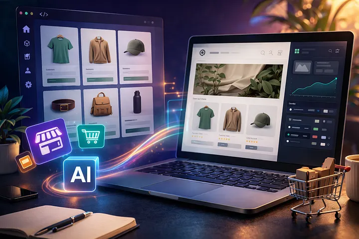
Informational Infographic
Purpose:
- Share an overview of a specific topic
- Introduce a new idea or concept
- Making information like a blog or article more engaging for your reading
An informational infographic is a suitable format if you’re about to present a highly technical subject to an audience who is not familiar with the topic.
How:
- To increase engagement, use illustrative icons and descriptive headers to introduce the main points of your infographics.
- For each section of your infographic, use numbers (when appropriate). Numbers improve readability and comprehension.
- Keep your infographic color palette to three to five colors. It improves the overall appearance of your infographics.
- Make sure to use your company logo and website for extra coverage
Examples + Templates:

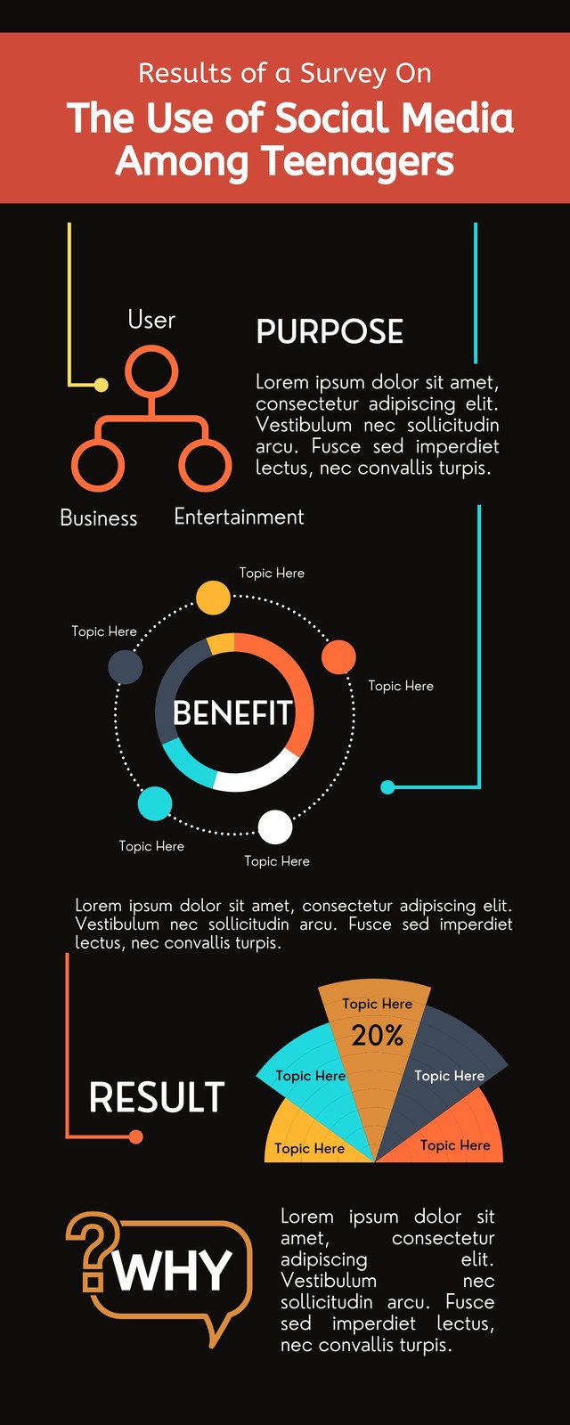
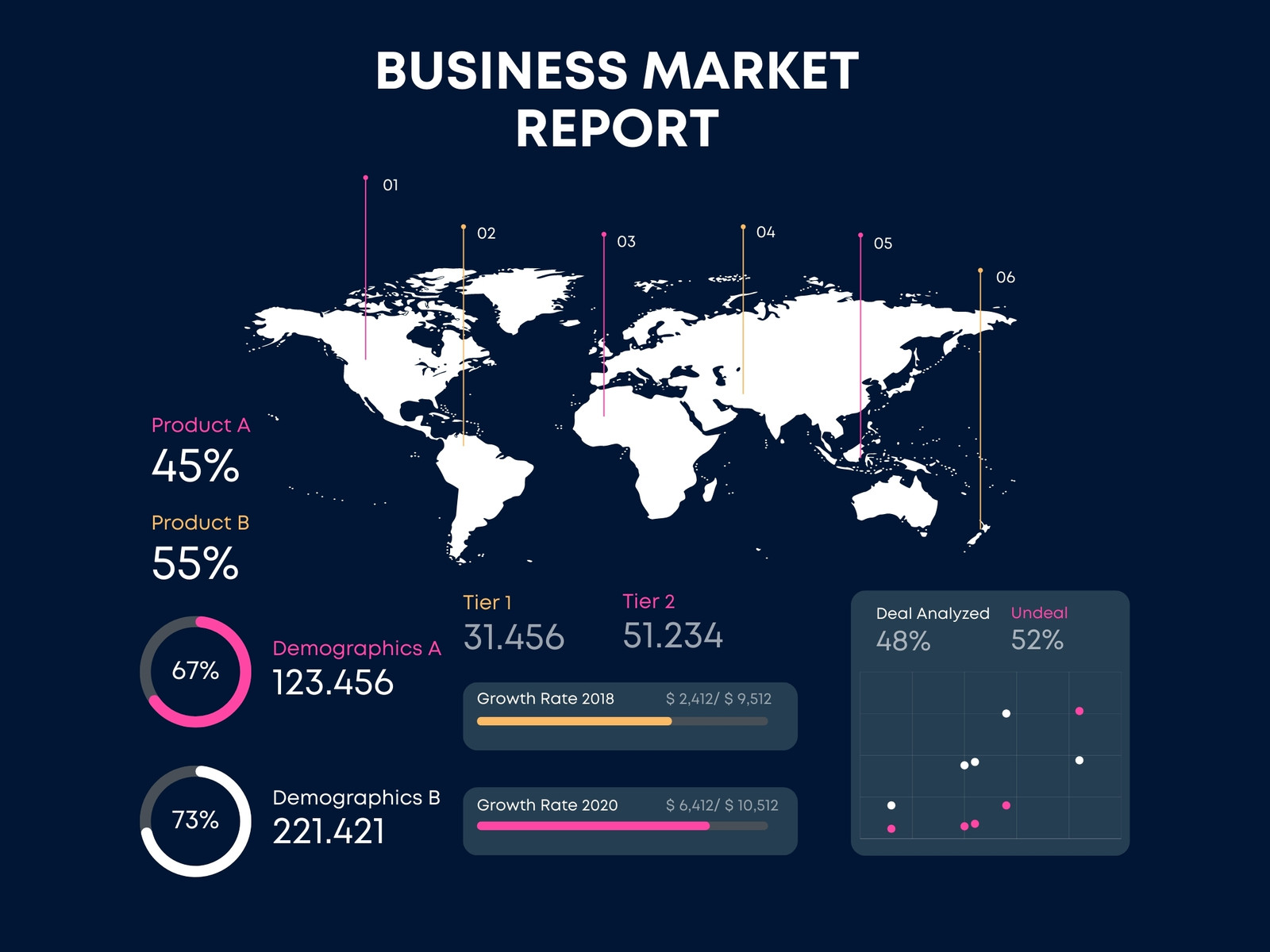
Data Visual Infographics
Data visualization infographics are the most commonly used infographic chart type for communicating data through charts and graphs. This type of infographic is similar to bar graphs and pie charts, but its main purpose is to go beyond reporting statistics by incorporating visual elements.
Purpose:
- A persuasive argument, viewpoint, or argument.
- Statistical impact.
How:
- Colors, icons, and pictograms that match the text or number can be used to direct attention where you want it.
- Select the appropriate graph or chart for your data.
- Label your graphs and charts clearly.
- Find the central theme in your statistics and use it to tell a story. Your data visualization infographic should answer: why should I pay attention to these statistics?
Examples + Templates:

Feeling stuck in your entrepreneurial journey? Then you wouldn’t want to miss out on these unique growth hacks that’s generating double the profits for business owners.
Get exclusive frameworks curated by experts in this FREE GROWTH HACKING MASTERCLASS by Vatsa Vishesh.
FREE for a limited time. JOIN TODAY!
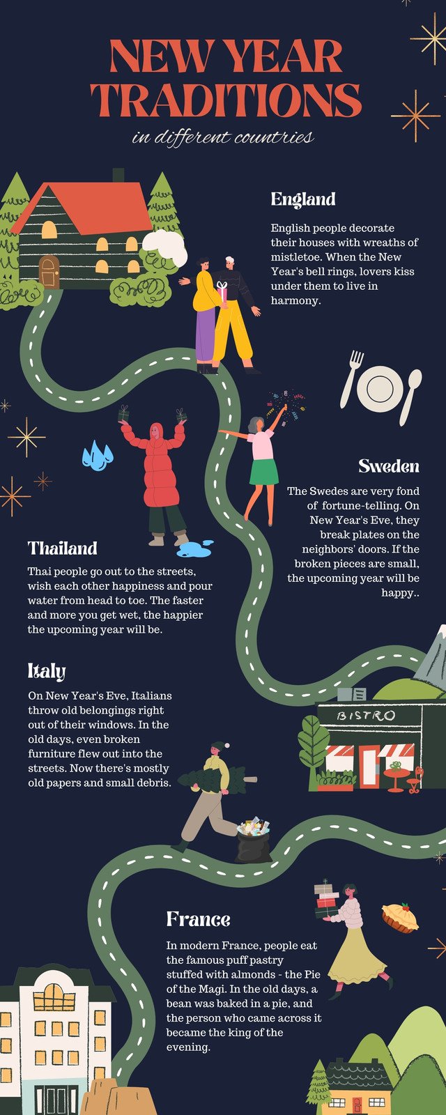
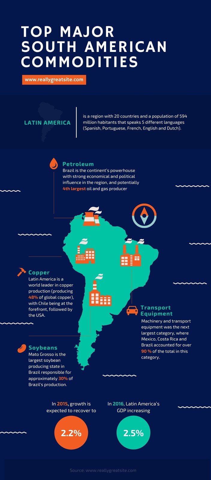
Map infographic
If you want to present demographic data or share location-based information, a map or location infographic is your best bet.
Purpose:
- Show trends in a specific location — global, national, state, cities, towns, or even your own neighborhood.
- Share visual stories about a specific location.
- Distribute regional and global statistics based on geographic location.
How:
- Keep in mind map color conventions. For example, blue stands for bodies of water like rivers, oceans, and lakes. Meanwhile, the color red is reserved for areas of special interest, such as military bases. It also helps to use darker colors for comparing regional areas or places that you want to highlight.
- Don’t forget about important details like your map legend, scale bar, and data source. These particulars aid your audience’s comprehension of your map infographics.
- Avoid clutter by giving your labels more thought, as shown in the map infographic example below.
Examples + Templates:
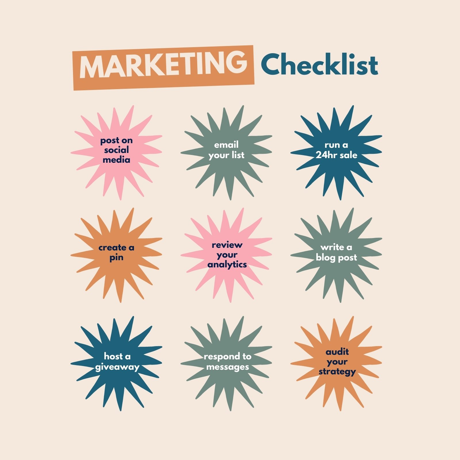
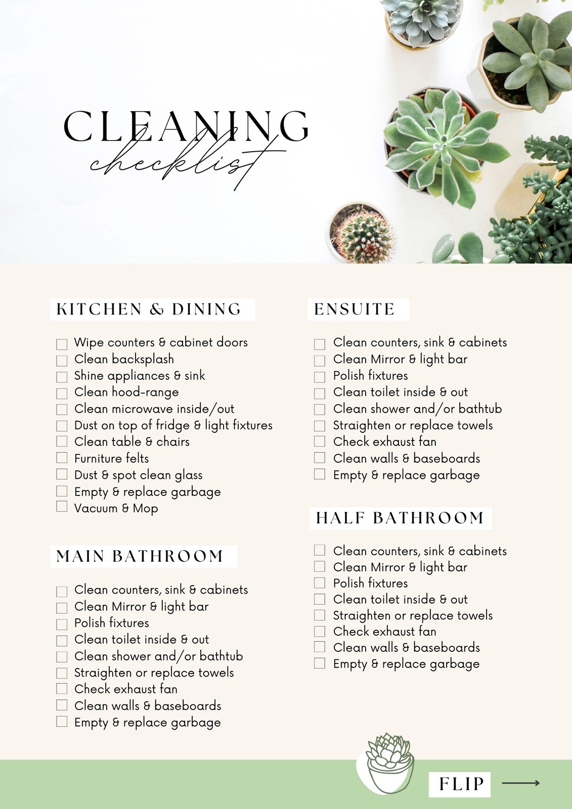
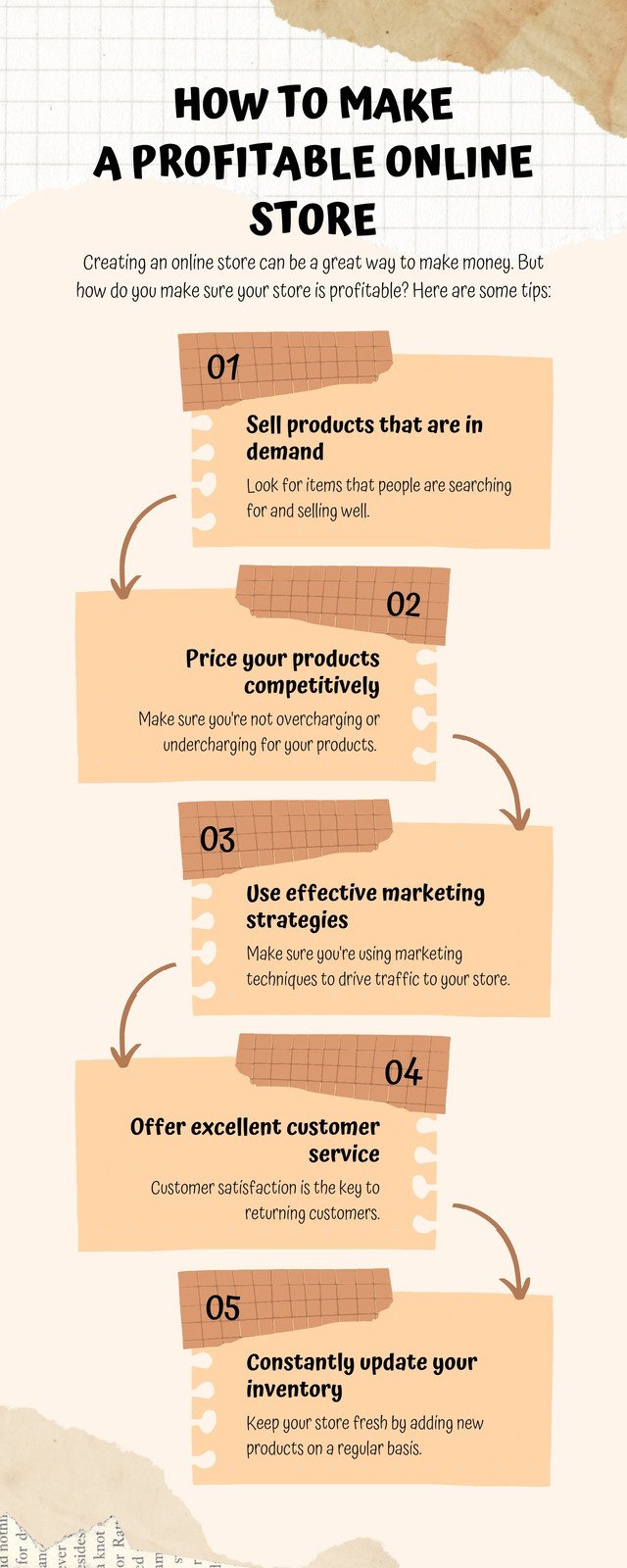
List Infographics
The human brain loves lists, which explains why list infographics are so popular. List infographics are an excellent choice for everything from checklists to to-do lists.
Purposes:
- Share a tip collection.
- Support an idea or topic with major points.
- Presentations summarized.
How:
- Keep your list short and on point in a list infographic.
- To group elements together, use borders, numbers, or boxes.
- To make important points stand out, replace bullet points with icons.
Examples + Templates:
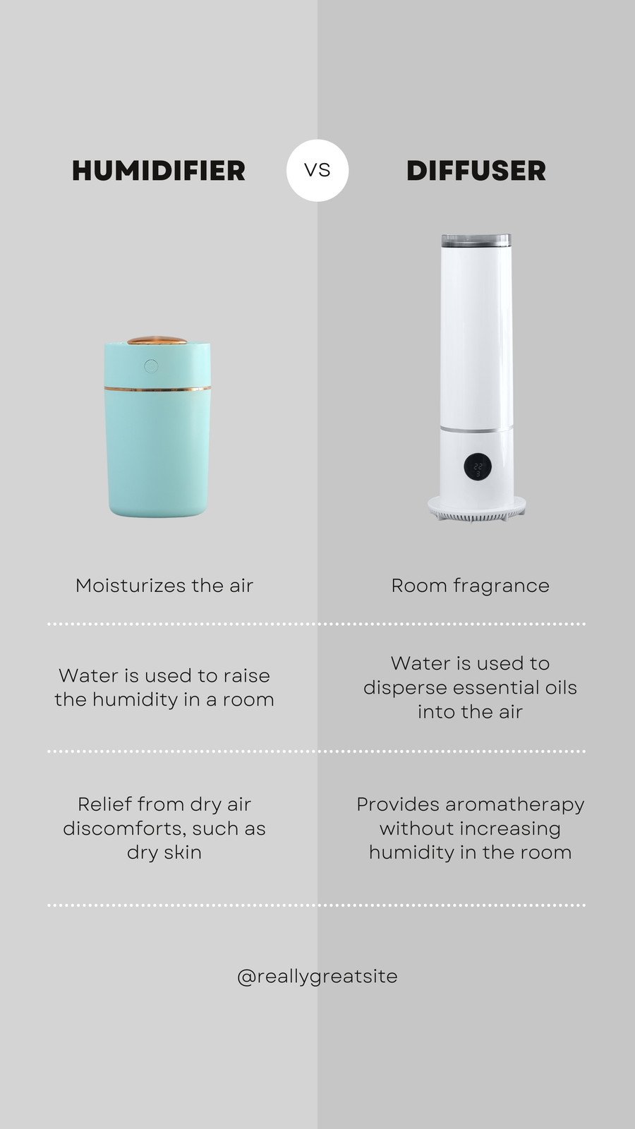
Comparison Infographic
The comparison infographic or versus infographic is one of the most popular types of infographics that can be found in blogs, social media, and emails. It’s widely used for a reason: it aids in decision-making when deciding between two or more objects, places, ideas, or concepts.
Purposes:
- Encourage your audience to consider two or more points of view.
- Consider the advantages and disadvantages.
- Display the similarities and/or differences.
How:
- Colors should be used strategically. In this type of infographic, for example, assign a different color to each topic or idea. For example, “Pros” can be used as green and “Cons” can be used as red.
- Divide your infographic into horizontal and vertical sections. If you want to compare multiple options, you can also use borders and tables.
- Using boxes or bubble charts, group similar topics together.
Examples + Templates:

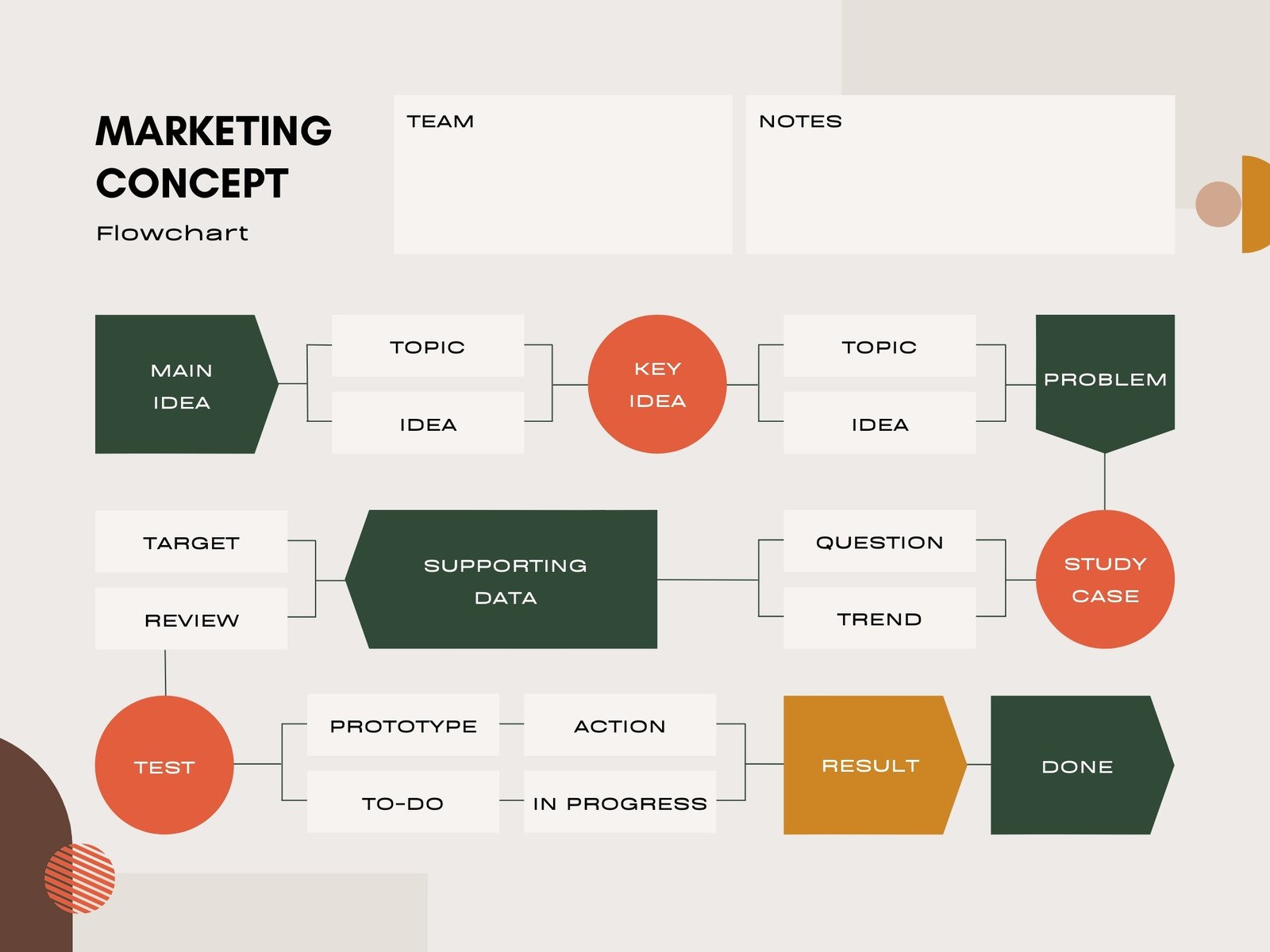
Flowchart Infographics
A flowchart infographic depicts a series of steps in a process or action. It employs a combination of layout, images, and text to ensure that all stakeholders understand your process, how it works, and what your goals are.
Purpose:
- Workflows should be simplified
- Provide solutions.
- Idea generation.
- Consider the command structure.
- Discuss potential scenarios or consequences.
- Clearly and concisely describe processes with multiple paths.
How:
- Begin your flow chart in the upper or down left corner of your statistical infographic.
- Create an organizational chart with flowchart symbols such as arrows, numbers, dots, or lines to encourage readers to follow along.
Examples + Templates:
Process Infographic
If you want your audience to remember the details of a process or procedure quickly, use process infographics.
Purpose:
- Break down a complex process into manageable chunks of information.
- Give a summary of the steps in a process.
- Consider a procedure.
How:
- Each step in your infographic should have its own color.
- To direct readers to the next step, use directional cues such as arrows, numbers, or lines.
- The S-shape format, as shown in the process infographic example below, saves space.
Examples + Templates:

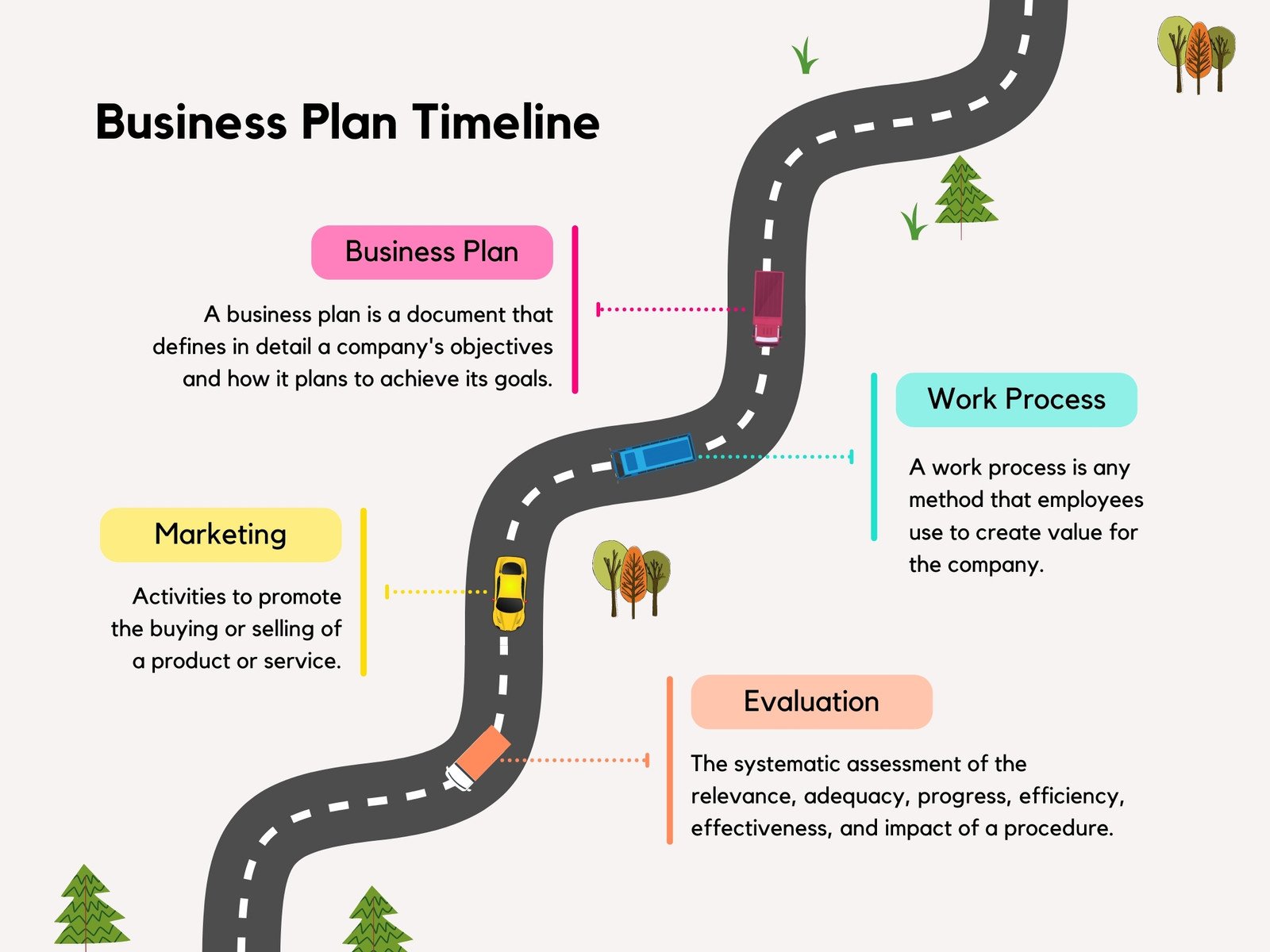
Timeline Infographic
A timeline infographic allows you to visually demonstrate how an idea, project, or story came to be, from sharing the origins of dessert to presenting an overview of key statistics from your work history.
Purpose:
- Display historical progression.
- Make preparations for an event.
- Emphasize a series of events.
- Take your audience on a journey.
- Tell your story in chronological order.
- Set the audience’s expectations for the length of a process.
- Share achievements on various social media platforms.
How:
- To illustrate significant points in your timeline, use simple icons.
- By contrasting colors and adjusting font sizes, you can emphasize each major point.
- A line connects different points in time (using line graphs as inspiration).
- Label major points and provide a brief description if necessary.
Examples + Templates:

Want to master in-demand skillsets and take your business to the next level? Join Standout’s Mad Growth Accelerator. It is a FREE 30-Day Digital Marketing Training with that will help you drive growth and transform your business from $0.
And to be clear – The Mad Growth Accelerator is 100% FREE! CLICK HERE TO JOIN.
Best Free Platforms to Create or Customize Infographics
- Canva: Canva is a powerful online design tool (and infographic maker) that lets you create a wide range of designs even if you have no design experience. Canva also offers a large selection of templates from which to choose based on your specific design requirements. Many of the templates are free, and some include elements like icons and pictures that you can buy or replace with your own).
- Venngage: Venngage, like Canva, gives you a few different options to choose from when it comes to what you want to create. There are many free templates for infographics.
- Piktochart: Piktochart is another excellent tool for creating various types of infographics. There are several formats to choose from, including a traditional infographic size (tall and skinny), presentation size (for slide decks), poster, and report. You can then either create your own infographic from scratch or use one of their templates (most are free).
Now, we hope you have a better insight about how to make infographics and ways it can be leveraged for marketing needs.
As you create more infographics, you’ll discover more opportunities to communicate visually with your customers and team, build highly relevant backlinks, and develop relationships with companies and industry influencers!
[For those eager to stay ahead in the ever-evolving landscape of AI and business, we’ve got something special for you.
1. The AI Entrepreneurs Newsletter – With a readership of over 55K entrepreneurs, this newsletter is a treasure trove of insights you won’t want to miss. Subscribe here to stay ahead of the curve
2. Unlocking The AI Advantage Podcast hosted by Ramesh Dontha, a serial Entrepreneur, Angel Investor, Award winning & Bestselling author. With focus on Artificial Intelligence and Entrepreneurship, Ramesh works with aspiring entrepreneurs who are focused on disrupting various industries with technology. Listen here]
Are you looking for expert action plans for your business? Then you have to become a STANDOUT BRONZE MEMBER because you can get exclusive business products comprising unique blueprints worth $10,000+ at just $9 per month – available only to their BRONZE MEMBERS.
Get your hands on exclusive SOPs, Courses, Workshops, and Events. Gain Exclusive access to STANDOUT’s community of mentors and founders from all over the world. Grab it now because the offer is available only for a limited time. BE A MEMBER today!